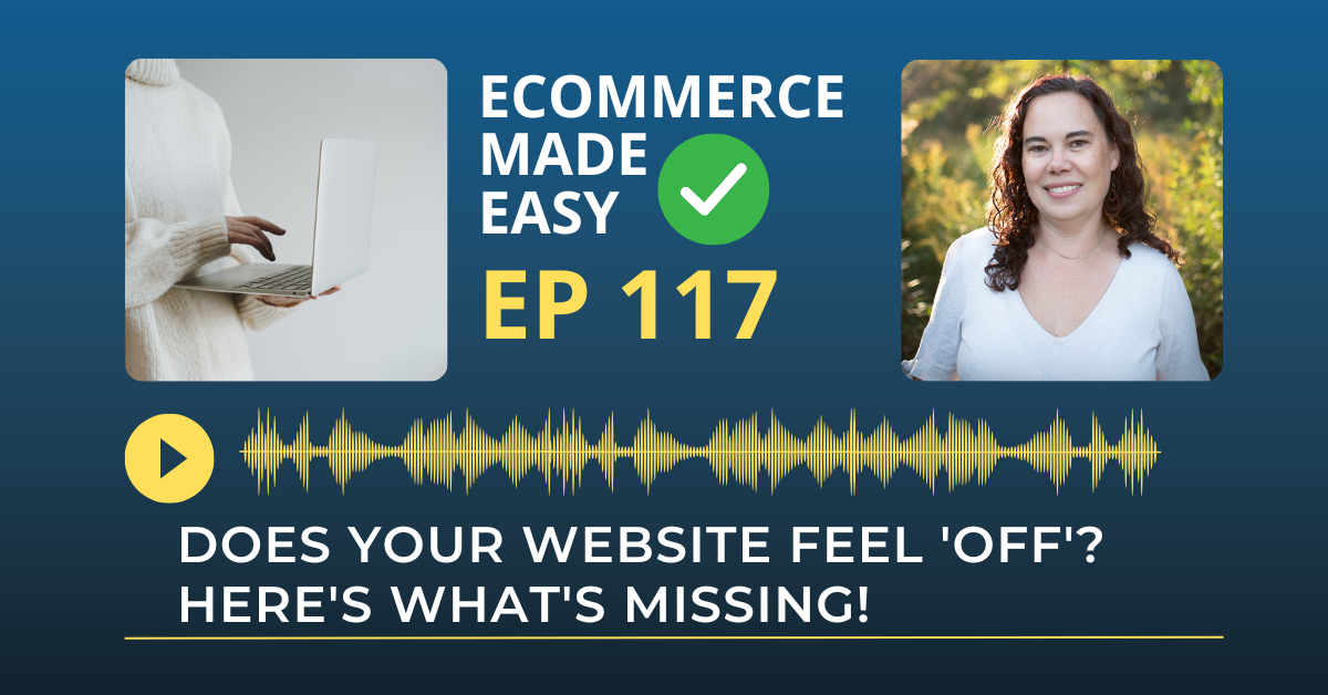
Ever look at your website and think, ‘Something just feels… off’?
You’ve put in the work. The branding looks good. You’ve got your offer front and center.
But you’re not seeing the sales, the leads, or the engagement you expected.
Here’s the truth: when your website feels off, your audience feels it too, and they bounce before you ever know they were there.
After working with online business owners for over 20 years, I’ve seen exactly what creates that ‘off’ feeling—and more importantly, how to fix it.
If even one of these things is missing, it’s costing you revenue.
Let’s Recap: When Your Website Feels “Off” — Here’s Why
The feeling is all too familiar – you’ve invested time and resources into your website, yet something just doesn’t feel right. You’re not seeing the conversions, leads, or engagement you expected. This disconnect isn’t just frustrating; it’s actively costing you revenue.
After two decades working with online business owners, I’ve identified five critical elements that, when missing or misaligned, create that unsettling “off” feeling that drives potential customers away before they take action.
1. Lack of Visual Hierarchy
While your website might be aesthetically pleasing, it may not effectively guide visitors’ eyes to the next step. People don’t read websites – they scan them, much like window shopping. If everything on your page has the same visual weight or lacks white space, visitors can become overwhelmed and leave.
The fix: Create visual variety with clear, compelling headlines that quickly communicate who you are, who you serve, and what you offer. Use bold call-to-action buttons that stand out (without being garish), and incorporate intentional spacing. This creates a natural flow that leads visitors toward conversion.
2. Confusing or Generic Messaging
If the words on your website could easily be copied and pasted onto someone else’s site, it’s time for a rewrite. Your visitors should instantly understand what you do, who you serve, and what to do next.
The fix: Focus on using customer-specific language. Your messaging should answer the question every visitor is subconsciously asking: “What’s in it for me?” Speak directly to their needs and make it easy for them to take the next step.
3. No Social Proof
Without social proof, visitors are left wondering whether you’re trustworthy or credible. Testimonials, reviews, and client logos reassure people that others have trusted you—and gotten results.
The fix: For service-based businesses, sprinkle testimonials throughout your site rather than placing them in a single section. Product-based businesses should showcase reviews on individual items and include a general testimonial section. If you’re new to business, you can even use testimonials from past employers or people who know your work ethic and character.
4. Too Much Professionalism, Not Enough Personality
It’s easy to slip into sounding overly polished—but that can create a sterile experience. People buy with emotion first and justify with logic second. If your site lacks personality, it won’t connect.
The fix: Infuse your site with warmth, friendliness, or whatever tone reflects your brand best. Share your founder story. Include a photo of you or behind-the-scenes glimpses of your workday. You don’t need to overshare—just show you’re human. Those emotional touches build trust and connection.
5. Inconsistent Design
Disjointed visuals—like mismatched fonts, clashing colors, or inconsistent photo styles—can subtly erode trust. Visitors may not be able to name what’s wrong, but they’ll feel it.
The fix: Make sure your website’s design elements are aligned and cohesive. Whether your brand is playful, calming, sleek, or bold, your visuals should reflect that tone consistently across every page.
Start Small, See Big Changes
The good news? You don’t need a full redesign to fix that “off” feeling. Start with a simple 60-second scan of your homepage. View it through the eyes of your dream client:
- What stands out first?
- What’s confusing?
- What undermines trust?
Ask a trusted friend or business colleague for honest feedback. Then, choose just one of the five areas above and give it a refresh this week. Tackle another one in a few weeks, and keep going from there.
With intentional tweaks and a little patience, your website will become a conversion-driving asset you’re proud of—and your dream clients will feel right at home.
Rate, Review, & Follow on Apple Podcasts
If you’re loving my eCommerce Made Easy Podcast, I’d be thrilled if you could rate and review the show on Apple Podcasts. Your ratings and reviews help me reach more listeners and empower more people like you to thrive in the online business world.
Just click here to head over to Apple Podcasts, scroll down, give us a five-star rating, and share what you enjoyed most about the episode in the “Write a Review” section.
If you haven’t hit that follow button yet, now’s the perfect time! I have new episodes coming your way every week that you won’t want to miss. Hit the follow button and stay up to date with the eCommerce Made Easy Podcast! Follow Now!